Monday 14 December 2015

Dissertation

This week has been slow with practical work due to writing my dissertation. I have found doing research into textiles and wellbeing really interesting and came across a very interesting theory of colour called chromophobia. This has inspired my practical work because I am very aware of my bold colour use and how it could be seen as “too eclectic” or perhaps unprofessional, but chromophobia is the idea that Western society has made colour seem “foreign” or “childish” or “unprofessional”. Reading about this social phenomenon helps me feel more confident in taking risks and challenging these concepts of colour. 

I have also found that doing my essay on wellbeing has been quite relevent to my self-initiated brief because of the gratification I have got from helping someone see a whole new colour. ot only has it contributed to my wellbeing, doing a project to help someone else, I also feel like it's may have helped improve his wellbeing taking time out to consider how he sees colour. 

Finally it all seems relevant to my new live brief based on the Gawthorpe Hall Archives, which is full of amazing intricate hand embroidery done by people who will have used embroidery for the same wellbeing purposes we use it for today. 

Friday 4 December 2015

Developed Colour Drawings

Although my work is quite similar to Michael Kidner’s work I have decided that I will not participate in that live brief. Although looking at his work has been quite helpful when creating my own: 


 I’m not sure my work would be totally appropriate to that brief. I also really like the look of the Gawthorpe Hall project and think this would be a more inspiring project to take up. I feel like if I took up the Michael Kidner brief I would just be creating work I was going to create anyway. It makes more sense to me to take up a live brief that inspires me to create new work instead.
 

In light of this, I have continued my sketchbook in order to create a little book of colour. I absolutely adore doing these drawings, although they are quite time consuming. My latest drawings have explored using watercolour one way and brighter lines drawn the opposite way. I love the colours produced by the watercolour and the bright contrast of the inks.


I think these would be really interesting to reproduce with the idea of cutting holes into fabric and then laying or stitching threads behind. 

I have also done some drawing that play around with the idea of shape as well as colour: 


I really enjoy these drawings and see a lot of similarity between these and Victoria Snape's: 


Like my more recent drawings there is a geometric look that has been disrupted by a hand drawn element. 

I look forward to taking these drawings into fabric, I will experiment with aplique, hand and machine stitch, making sure I pay attention to the white space surrounding and colour matching. 


Wednesday 4 November 2015

Developement

After deciding that the large scale samples were not quite appropriate for my work I decided to try and create some medium sized samples that could potentially be used as "ribbons" in something bigger to try and maintain some of the colour intensity. However I found that I really liked them as a little collection that gradually increase in scale: 


I enjoyed creating fabric samples with the embellisher and then using the photocopier as a tool to manipulate these samples. 


I then decided to print these onto acetate to see how the opacity affected the drawings, and then developed these further by adding a solid satin stitch. 


I thought it would be interesting to make these little pieces into something light could come through. So working with my scale I felt that fairy light shades would be an appropriate context for my work: 


I really like the way the light comes through and creates different coloured shadows. Although I think my work does look good in a lighting/interiors context I think next unit I would like to try make some more final products.
I can maybe see my work as smaller feature such as a pocket or edging on a garment, alternatively as a bigger statement piece such as a scarf: 


http://scarletchamberlin.com/2014/10/09/full-mooned-darning/


 It would also make a good feature on accessories or perhaps even interiors such as cushions. 

Thursday 22 October 2015

Up-scaling Samples

In order to upscale my work, I have experimented with a variety of techniques. I have created patchwork sample using disperse dyes. I also tried to recreate the grid effect using satin stitch and fill stitch on the multihead embroidery machine.


I really like this sample because I feel I have successfully used a fully computerised technique to create something with irregularity that reflects my hand drawn style. 

I also experimented with the use of ribbons and disperse dyed fabrics. Again by creating small irregularities in a larger repeat pattern I've feel I've added an element of the hand drawn. 


I also attempted to produce some prints using my smaller Bradford Brief sample and taking it into photoshop and editing it.


 I really enjoyed doing this in photoshop however I’m not really sure what kind of context it could be applied. I also feel like digital prints are a little flat to fit in with the rest of my work, so maybe next time I would produce some that I could work back in to.

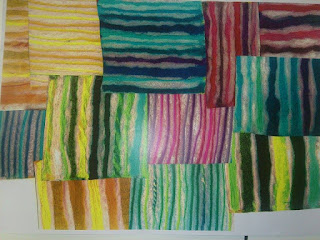
Finally I like this patchwork sample made of fabric I have disperse dyed and cut up and patched back together. I feel it best represents one of my samples blown up to A2 size.


Although I am pleased with the outcomes and can see them more easily fitting into a fashion or interiors context, I feel that my samples are more interesting on a smaller scale. Larger scale samples seem to lose their intensity that is so prominent in my drawings. I also found that to maintain the intensity, the samples were equally, if not more, time consuming. Finally they lose the slight optical illusion effect that is quite prominent in both my drawings and the smaller samples. 

Saturday 3 October 2015

Reflection

I am pleased with the board I have produced for the Bradford Brief, I am really like my needle weave sample however I feel like I need some more direction in terms of my context. I feel like designing for a collection of final samples is very difficult to communicate visually. 


I found the two tutor crit this week really helpful. I enjoyed hearing lots of fresh opinions on my work as well as suggestions for new techniques. I am looking forward to developing my work further, I am looking to increase the scale of my work by using printing techniques and found fabrics. By using these techniques I should be able to create less time consuming samples.
It will be really interesting to see how the scale of my work affects the intensity of colours.  

I also got some helpful advice at other artists to look at that produce similar colour based work such as the Bauhaus Weavers:


https://uk.pinterest.com/explore/bauhaus-textiles/


https://couleurblind.me/2011/08/23/gunta-stoelzl/

I really love the colour use in these pieces and really relate it to the way I use it in my drawings. And although these are woven pieces I feel like they are particularly relevant to my constructed style of embroidery. 

Saturday 26 September 2015

Colour Curation

I had the opportunity to show my colour blind friend, who sparked my self-initiated project, all of the samples I had made and it was fascinating to hear what colours he could see. There were a few colours (particularly the pale pink and the bright turquoise) that he saw to be a different colour pretty much every time he came across it. It helped me see in my own work how the surrounding colours have an effect on one stand-alone colour. Also it was encouraging to hear that although he said it wasn’t very obvious to him, he was starting to understand the concept of the colour purple which he was previously completely blind to. Although I am not sure of the final context for my work, it is really satisfying to have produced work that has so positively impacted on someone’s life and quite literally their vision. This has impacted on some of the research I have done for my dissertation and encourages me to keep my eye out for arts/health and wellbeing opportunities in the future. 

I have also been offered the opportunity to exhibit my work in collaboration with some Art History/Curation students which I am very excited about. The exhibit is called “Curation of Colour” which is obviously a fitting theme for my work. Having sent the curators images of my work they have offered me a window space so that the light can really enhance my work. I am excited about collaborating especially because they have not asked for a specific piece to be made they just want to curate samples I have already made, so it will be really interesting to see how they curate my work. 

Monday 21 September 2015

Experimenting

This week I experimented with lots of different techniques creating a range of samples. I really like the effect created by contrasting a bold machine satin stitch with the more irregular hand stitch. I feel this reflects well where I have used different media in my drawings.


In an attempt to create some speedy samples I tried to lay down threads and stitch over them. Although I like the colour mixing in these samples I feel like some of the linear and grid qualities of my drawing have been lost.

To take a different approach I experimented with some beading in between machine stitches which although I quite liked the contrast in weights of fine fabric and heavy beads however not all of the beads were opaque and some of the colour intensity was lost. Also I feel that the uniformity of the beads means the hand drawn qualities of my drawings have also bean lost.


I also found this with some samples I created using water soluble. I found that a lot of the linear grid qualities were lost and that having a white background would better reflect my drawings.


I have also created some only hand stitched samples, the first of which was needle weaving. I really like this sample because I have used the three primary colours and woven variegated threads through, which really recreates a pixel effect. I also like this sample because it creates a little series and sits well in the white space around it.


This week I would like to try and keep my backgrounds white to better reflect my drawings and experiment with found materials such as ribbons to help make some of the processes a bit quicker but still maintain a strong grid structure. 

I really enjoy creating these small scale samples, I think in terms of context I would like to produce a collection of final samples that might be bought by others as inspiration. It would be interesting to try and produce a sample book similar to the work available from James Hare Or some kind of colour trend book similar to ones found at: http://www.james-hare.com/607-embroidered.html


Monday 14 September 2015

Colour Research

Having spent the summer doing drawings extracting colour from places I’d visited over the holidays, I was swapping visual research with a fellow art and design student who is colour blind. He told me he couldn’t see the colour purple. I was really taken aback by the idea of someone not being able to see an entire colour. So I started thinking about ways in which we as humans create colour and mix colours. He is blue/pink and green/red colour blind so it would make sense that he would struggle to see purple. After considering ways in which colour is made up on screens in pixels I decided I would see if there was a way to translate this effect into fabric. After exploring and looking deeply into woven fabric that use different colours for warps and wefts and how that can drastically change how a colour looks I decided to create some drawings:


I have thought about using lots of different materials for my drawings including inks, crayons and coloured papers for collage, however I feel these crayon and ink combination drawings are particularly successful. 
I think I’d like to experiment using the embellisher and couched down threads as well as experimenting with different hand stitch techniques such as needle weaving and kantha stitches.
I think it will be really interesting to see if I can recreate this different marks made by the different media I have used and whether I will be able to maintain the same level of optical illusion as I have managed to achieve in my drawings.
I really like the “grid” quality of my drawings and how this reflects woven cloth in my drawings and I think this is something I want to try and recreate in my embroidery. 

Saturday 4 July 2015

Degree Show 2015: Reflection and Analysis

Holly Jane Dixon :
I draw comparisons between mine and Holly's work because of the way she has taken something black and white and injected colour into it. This is also how I like to work. She is mainly a print based student but she seems to enjoy producing samples of fabric that are constructed. The samples themselves are not constructed for practical purposes but they could easily be bought and used for inspiration by a production team. I think this is the kind of thing I'm very interested in producing, one off pieces that could be sold to a design company to then alter for their own purposes. 

Mariam Nadeem:

I feel this work connects to my own because of the combination of processes. I enjoy combining and contrasting hand and machine processes in the same way Mariam has combined hand printed and digital processes. I think this way of working is more suited to a "one off sample" context as obviously hand processes can be very time consuming and tricky to replicate.

Eden Lysette Blaber:


Although Eden's work has a decided context (fashion), I feel it bares a lot of similarity with my own work in terms of originality, she has produced work that is confident and different. I also feel her work is quite experimental which has lead to very considered composition which is how I aim to work. 

I have found looking at degree show work very useful in reflecting on my own practice especially in terms of how I should present my work and making sure my intended context is obvious. However I am very interested in achieving full artist self sufficiency from fibre to fabric so I will have to consider very carefully how I might present this at the end of the year. 

Monday 18 May 2015

Reflections


This project has seemed backwards from our usual units. We had to come up with a context before we started sampling. I did not find this useful, because although I made the decision to make scarves I feel the work I produced equally fits an interior context as shown here:


I feel this way of working does not suit me very well because I feel like the fabric I create is more just a design to be bought and for the individual to decide its purpose, so assigning my ideas a product felt strange and limiting.

However deciding a final context did help some of the decision making such as materials and in terms of keeping the length of time each scarf took to make down, in consideration of keeping costs of labour reasonable and the overall price. Also choosing a “high end/designer” context helped me refine my fabric choices and to inform my scarf designs forcing them to have simplicity.  
I enjoyed doing visual research and allowed it to fully inform decisions such as fabric and techniques used. I found myself feeling more confident with this element of the unit than I have done previously and look forward to practising it over summer. I enjoyed the activities that allowed us to meet new people and see a variety of work, as I have mentioned in earlier posts, had I done these maybe a few weeks before having to make the decision of whether to collaborate, I think I would have done and enjoyed doing so. As for tutorials and feedback, I felt I was challenged as an embroidery student with little to no contact with even a textiles tutor, or other embroidery students during tutorials. However this did not deter me from taking part in feedback sessions and attempting to give feedback on things I felt I knew little about. It was nice that 3D and graphics students asked my opinion on their products as a fresh pair of eyes to their work and the processes available to them.  Finally I really enjoyed the experience of putting up the exhibition at the Federation House, helping people decide the best way to present their work and coming up with creative solutions to achieve that.

I feel I have developed massively in terms of contextual understanding, taking time to refine my use of colour (which would otherwise been much more eclectic) to suit the style of the high end/designer shop as well as making sure I use high quality fabrics. I feel like I better understand the importance of dying fabrics myself instead of using shop bought, which also comes from the desire to create a high quality/designer product.

My primary motivation for decision making was my visual research, when it came to making decisions about refining my work I was then motivated by my context. I also feel I considered the three words “personal, intelligent and playful” given to us in the brief as well as the idea of “limited edition”.


I am pleased with the choices I made regarding my materials and processes, they made excellent functional products. If I had more time and money I would like to have expanded my selection of designs that played with scale. Also I would have liked to develop a label or packaging for my product. Although my digital skills have improved since last unit, I feel designing packaging for myself would have been difficult in the time limit.
In the future I will be more confident in creating a final product in order to visualise a context but intend to take full advantage of sampling during future projects. I would also like to collaborate in future projects and might do so in order to brand myself.


Friday 1 May 2015

Investigations

After some reflection over Easter and doing some samples, I have decided my product should be a scarf. I have produced some hand and machine samples using fabrics and embellishments suitable for this context.
Here I have hand sewn beads arranged so that they best represent "Plato's Disco" and it's shadow. I like this sample because of the heavy weight of the beads against the light Dupion silk fabric and the way this would affect the drape of a scarf:


This sample is cotton threads sewn down on water soluble fabric which I have then sewn 2/16 ply yarns across the empty spaces. Although I love this sample, the stitching is too heavyweight for use on a scarf and I fear if I were to try with less stitching it would not hold it's structure:


This a combination of the thicker 2/16 ply yarns and the variegated threads delicately stitched on the Irish machine. This creates a very bold impact and I think I will use to embellish the end of my scarves:


This sample is a variation on traditional kantha stitch using colour change thread to create diamond shapes:


Finally this is hand dyed patches of light cotton that I have sewn with contrasting grey thread using blanket stitch on the PFAFF machine:


A lot of the samples I have done produce a messy back so I did some embroidered scarf research to see how others have tackled this issue. I found Siobhan O’Brien, I really like her embroidered scarves.


Here she has used different coloured panels to make a double sided patchwork scarf.

So I have decided to make double sided scarves made up of patchwork panels, I need to buy my fabrics (I have decided on silk linen and dupion silk) and then cut these up into patches to be dyed separately both tonal greys and one side of a scarf to be brighter colours. I then need to get in the machine rooms and construct each side, embroider each side and then finally sew the scarves together.


After doing a narrative workshop with Alice Kettle I have realised how much more value is added to an object if it has a strong narrative. If I were to make packaging I would tell the story of my scarves, where they took their inspiration and the processes I have used to make them.
This workshop also taught me the benefits of collaboration. It was fun and interesting seeing what was inspired in other people’s minds by the objects we were given.

So far all of my tutorials have been with 3D tutors and predominantly 3D students. This has proven very interesting in terms of the kinds of suggestion I've got from them that seem focused on things like the final product and garment structure as apposed to advice concerning techniques, suggesting materials, sampling and alternatives to finished products. This focus is a new perspective and I think it's motivating me to produce a different kind of work.  


Wednesday 25 March 2015

Research


I enjoyed our visit to the Whitworth and finding out more of what this brief is all about. I have chosen to do visual research based on the contrast of colour and tonal greys at the Whitworth. I have done this by picking out colours from pieces of work in the gallery, my favorite being "Plato's Disco". For my tonal greys, I have done drawings of the floor and from sections of paintings.


This is some of my visual research:


I intend to combine the colourful elements of my drawings with the tonal greys whilst sampling so I can get an idea of the best proportions for effective colour contrasts. I would like to experiment with a combination of kantha hand stitch, bead work and machine free motion machine embroidery. It will also be interesting to experiment with different weights and textures of fabrics too.
I am not yet sure which of the two shops I would like to create a product for, I feel like the children’s shop would be most suited to my intense colour use, but it might be nice to try and refine that and make something for the high end shop.


I think I would like to design either a scarf for the high end shop, fabric for a patchwork fat quarter pack for the high end shop or maybe a patchwork kit designed for the kids shop. If I choose to make a scarf I will need to make some decisions about whether it will be an evening dress scarf or a warm practical scarf. If I choose to make a pack of Whitworth fabric fat quarters for quilting, I will need to choose a lightweight but reasonably strong and durable fabric and will need to think about placement of stitching in terms of avoiding breakages in stitch work if the customer wanted to cut the fabric to size.  For the patchwork kit for kids I’d have to consider packaging and an instruction booklet for it to be successful.

I have enjoyed presenting myself to others with the intention of perhaps collaborating, which I don’t think I will end up doing, but it was a really good exercise and has made me more enthusiastic about the idea of collaborating in the future. I enjoyed the feedback back session and giving feedback to other students however didn’t feel the benefit due to the stark contrast in the way we are used to presenting our visual research and ideas on the textiles course opposed to those who do 3D or Graphics.


Sunday 22 February 2015

Evaluation

I have enjoyed this unit, getting to work on two projects with ultimate freedom for the basis of both has been very satisfying. This is the final product of my Apron Brief:


I am pretty pleased with how this turned out, I was pleased with my work on Photoshop work and my hand and machine embroidery. However after my last tutorial I would like to have organised my colour better and given my different techniques of colour work some space so that it could be fully appreciated, as it stands I feel it is a bit eclectic.

I also feel I could improve my garment construction skills, it might have been nice to try and use a more complex edging. Overall I am pleased with the outcome and with the knowledge of how to improve.

I have also enjoyed my self initiated brief, creating samples that are more refined with a very specific context has been a good experience and made me more considerate of my fabrics and processes.
If I had more time I'd like to have produced bigger samples or even a final costume piece and experimented more with different materials that would be appropriate for a carnival costume.

This unit I have also enjoyed the networking element, arranging work experience with Emily Wood at Cabasa Carnival arts as well as collaborating with a graphic design student on a branding project, which I feel will help in unit X for the Limited Editions brief.